
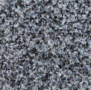


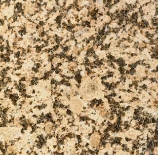
In high-end residential developments, hotels, commercial buildings, cultural projects and public landscapes, natural granite rarely appears in just one isolated area. Building entrances, arrival plazas, drop-off zones, courtyards, pedestrian routes, vehicular areas and landscape edges often require different stone formats, surface finishes and even different types of granite paving products.
For landscape architects, the key question is not simply which granite to specify. It is whether the paving language should remain continuous as the space changes, or whether a deliberate contrast is needed to mark a transition.
Continuity can create a calm, coherent relationship between architecture and landscape. Contrast can help people recognise entrances, routes, courtyards, vehicular zones and changes in function. But too much continuity can flatten the spatial hierarchy, while too much contrast can fragment a project into a collection of unrelated materials.
Continuity and contrast should therefore not be treated as two fixed design styles. They are tools for organising spatial hierarchy.
A well-resolved natural granite paving scheme depends on deciding what should remain consistent, what should change, and whether that change is best expressed through colour, format, surface finish, laying direction, joint density or a shift from granite slabs to cobblestones or kerbstones.
1. First decide whether the spatial relationship is one of continuity or transition
Before changing materials, it is useful to understand the relationship between the two spaces.
If two areas belong to the same functional and visual sequence—for example, a hotel entrance and its arrival forecourt, or an interior lobby axis extending into an external plaza—there may be little reason to introduce a strong material change. In this situation, granite can reinforce the continuity between building and landscape.
The situation is different when users move between spaces with clearly different characters: from an open arrival court into a more intimate garden, from a primary pedestrian route into a secondary courtyard, or from a pedestrian zone into a vehicular area.
Here, a change in paving can help communicate that spatial transition.
A useful design question is:
Should people clearly feel that they have entered a different type of space at this point?
If the answer is no, continuity should usually be the starting point.
If the answer is yes, the next question is not simply whether to introduce contrast, but how much contrast is actually necessary.
This is more important than selecting two granites simply because they look attractive together. Material changes should support the spatial concept rather than determine it.
2. Main building entrances usually benefit from continuity with the architectural order
Main entrances are one of the areas where granite paving can easily become overdesigned.
In an attempt to emphasise an entrance, designers may change the stone colour, slab size, laying direction and border treatment all at once.
Yet the main entrances of hotels, corporate headquarters, cultural buildings and high-end residences are usually already defined by architectural massing, canopies, door openings, lighting, landscape structures and strong axial relationships.
The paving does not always need to introduce another layer of visual contrast.
A more controlled approach is often to reinforce the order that the architecture has already established.
For example, where a building has strong horizontal proportions, the entrance forecourt might use large-format granite slabs with principal joints aligned to entrance openings, façade modules or architectural axes.
As the paving moves from inside to outside, the overall colour family and modular logic can remain consistent, while the external surface finish, slip resistance, thickness, levels and drainage are adapted to outdoor requirements.
Continuity therefore does not mean copying the interior floor directly into the landscape.
It means identifying which architectural relationships—proportion, axis, rhythm and material character—are worth carrying through.
3. Use controlled contrast when moving from an arrival space into a courtyard
The transition from a building entrance or main forecourt into a courtyard often involves a change in spatial scale.
The space becomes more intimate. Walking speeds tend to decrease. Planting becomes more prominent, and paving is experienced from a shorter viewing distance.
If the large-format granite used across a formal entrance plaza simply continues unchanged into the courtyard, the smaller landscape space can feel overly formal or visually oversized.
This is where controlled contrast can be effective.
For example, a main arrival space may use large-format grey granite slabs. As the landscape moves into the courtyard, the colour family can remain similar while the paving shifts to smaller slabs or granite cobblestones.
The colour relationship remains continuous, but the scale, joint density and surface texture begin to change.
Users can sense the transition from an architectural forecourt to a more detailed landscape setting without feeling that they have entered an entirely unrelated material environment.
Contrast, therefore, does not necessarily require a change in colour.
Format, texture, joint density and product type can create a meaningful transition on their own.
4. Avoid changing every material variable at the same time
Natural granite can create contrast in many ways: colour, grain, slab dimensions, surface finish, laying direction, joint width and the difference between slabs, cobblestones and other paving elements.
When too many of these variables change simultaneously, the contrast can become unnecessarily strong.
Imagine moving from large-format light-grey granite slabs to small dark-black granite cobblestones while also changing the laying direction, surface texture and joint pattern.
The design is communicating several different signals at once.
Unless the two spaces genuinely have very different functions or characters, that level of contrast may not be necessary.
A more disciplined approach is to identify one primary variable.
If the intention is to express a change in scale, keep the colour family similar and change the format.
If the intention is to distinguish pedestrian and vehicular areas, maintain a related stone colour but change the paving type and surface texture.
If the design simply needs to reinforce an edge, a darker granite band may be enough without changing the material across an entire zone.
Good contrast has a clear purpose.
5. Viewing distance should determine the strength of the contrast
Material differences that appear obvious on a computer screen or between small samples do not necessarily read in the same way in a completed landscape.
Across a large hotel forecourt, commercial plaza or public-building entrance, paving may first be seen from 20 metres away or more.
At that distance, subtle differences in mineral crystals, grain structure or minor colour variation are unlikely to establish a strong spatial hierarchy.
What people read first are larger compositional moves: changes in paving zones, laying direction, slab scale and overall tonal relationships.
In courtyards, terraces and entrance walkways, however, paving is usually experienced from only a few metres away.
Here, the grain of the granite, edge treatment, joint width, surface texture and subtle tonal differences become much more noticeable.
Large spaces should therefore establish hierarchy through large-scale material relationships.
More intimate spaces can use finer changes in format, texture and joints.
The strength of contrast should correspond to the distance from which the paving will actually be perceived.
6. Material boundaries should correspond to real spatial boundaries
Where a granite paving material changes is just as important as what it changes into.
Convincing material transitions usually correspond to an actual architectural or landscape condition: a change in façade alignment, the edge of a canopy, a doorway, steps, a planter, tree pit, linear drain, courtyard entrance, or the boundary between pedestrian and vehicular areas.
These locations already represent a spatial transition. The material change simply reinforces it.
By contrast, changing granite colour in the middle of an otherwise continuous plaza—without an architectural axis, functional change or landscape element to justify the boundary—can feel arbitrary and decorative.
A useful test is to ask:
If this material boundary were removed, would the spatial logic remain completely unchanged?
If the answer is yes, it is worth reconsidering whether the material change is actually necessary.
7. Granite slabs, cobblestones and kerbstones can create hierarchy within one material family
One of the advantages of natural granite is that a single material family can be developed across several product types and scales.
Large-format granite slabs, smaller paving units, granite cobblestones and granite kerbstones can all contribute to a coherent material hierarchy within the same project.
A high-end hotel entrance, for example, might use large-format granite slabs to establish a formal architectural character.
A secondary courtyard could move to smaller paving units.
Vehicular areas, or zones requiring a stronger paving texture, could use granite cobblestones.
Landscape edges could then be resolved with granite kerbstones.
The project can establish a clear hierarchy without relying on four completely different stone colours.
This is particularly useful in large landscape projects: variation can be created through scale and product type, while a related colour family maintains overall continuity.
Even a project based predominantly on grey granite can create a rich spatial hierarchy when slabs, cobblestones and kerbstones are used with clear roles.
8. Pedestrian and vehicular areas need legible differentiation
At hotel drop-off areas, residential entrances, shared streets and commercial forecourts, pedestrian and vehicular zones usually need to be visually distinguishable.
That does not necessarily mean using black and white paving or creating a dramatic colour contrast.
A project can maintain a consistent grey granite palette while using large-format slabs for pedestrian areas and smaller granite cobblestones for vehicular surfaces.
Changes in laying direction, joint density and surface texture can further reinforce the distinction.
This allows different functions to remain legible without breaking the overall character of the entrance landscape.
For high-end projects where architectural coherence is important, a strategy of similar colour, different scale or texture is often more controlled than a simple high-contrast colour change.
9. Plant-rich courtyards often need less paving contrast
In building entrances and hard-landscape plazas, paving occupies a large proportion of the visual field. Granite therefore plays a major role in defining the character of the space.
As a project moves into a heavily planted courtyard, however, the visual focus begins to shift toward trees, shrubs, water features, seating and changing patterns of light and shade.
If the paving continues to use very strong colour contrasts, it can begin to compete with the landscape rather than support it.
Material relationships in these areas can therefore become quieter.
Granite slabs and cobblestones in related tones can establish subtle hierarchy through scale and texture instead of dramatic light-dark contrast.
The granite still provides order, but increasingly acts as a background to planting and landscape elements.
10. Continuity does not require exactly the same granite everywhere
Natural granite varies in colour, grain and mineral structure. Different parts of a project may also require different stone types because of format, performance or procurement considerations.
Different granites can still belong to the same visual language if their overall tone, grain scale and visual weight are compatible.
A main entrance, for example, might use large slabs of a fine-grained light-grey granite, while the courtyard uses cobblestones made from another granite with a closely related grey tone.
The geological or commercial stone names may be different, but visually the two materials can still belong to the same landscape system.
For the designer, the important issue is therefore not absolute consistency of stone name, but control of the visual relationship between materials.
11. Contrast does not necessarily require a different stone
The same granite can create significant contrast through different treatments.
Surface finishes can alter colour depth, texture and light reflection. Different formats change the scale of the paving. Slabs and cobblestones create different joint densities and edge conditions.
Landscape architects can therefore create spatial hierarchy with a limited number of granite varieties by working with format, finish and product type.
This also has practical advantages on large projects.
As the number of stone varieties increases, sample approval, production batch management, colour control, replacement orders and site coordination generally become more complicated.
Reducing unnecessary stone varieties while retaining sufficient design variation can create a better balance between architectural expression and construction control.
12. Use paving mock-ups to evaluate continuity and contrast
Small stone samples are useful for assessing colour, grain and surface finish, but they reveal very little about the spatial relationship between two paving systems.
Completed paving also involves unit size, joints, laying direction, area proportions and the relationship between adjacent materials.
For important projects, a paving mock-up can therefore be used to evaluate whether the intended level of contrast is appropriate.
The designer should look beyond whether each individual stone is attractive.
From the principal viewing direction, is the difference between the two paving systems sufficiently legible?
Is the boundary too abrupt?
Do the relative unit sizes feel balanced?
Does the relationship remain convincing in direct sunlight, shade and wet conditions?
These questions are much closer to the experience of the completed landscape than simply comparing two loose samples on a table.
13. Establish a hierarchy of primary, secondary and edge materials
For projects with complex paving requirements, it can be useful to define the role of each material before selecting every individual stone.
The primary material establishes the overall character of the project and may cover the main entrance, arrival plaza and other major public spaces.
The secondary material responds to areas with different scales or functions, such as courtyards, pedestrian routes and drop-off zones.
The edge material resolves transitions, boundaries and level changes through kerbstones, narrow bands, steps or specially sized stone elements.
With this hierarchy in place, every new space does not require a new granite.
Primary spaces can continue the main material language.
Secondary spaces can introduce controlled variation through scale, texture or laying pattern.
Edge materials can provide clear but restrained transitions.
The result is a project with a rich spatial hierarchy built from a relatively limited and coherent material palette.
Conclusion: good material design is knowing where change is necessary
There is no universal rule for deciding whether natural granite paving should continue or contrast.
At a main building entrance, continuity with architectural axes and the primary material order is often the stronger approach.
Moving from a formal forecourt into a courtyard may justify smaller paving units, greater joint density or a transition from granite slabs to cobblestones.
Pedestrian and vehicular areas can be differentiated through paving type, scale and texture.
In planting-rich courtyards, material contrast can become quieter so that the paving supports rather than competes with the landscape.
What matters is not how many types of granite a project uses, but whether every material change corresponds to a genuine spatial reason.
A mature natural granite paving strategy can create hierarchy through slabs, cobblestones, kerbstones, unit sizes, surface finishes, laying directions and joint density while maintaining a coherent material language across the project.
When landscape architects can clearly identify which relationships should continue, which spatial transitions need to be expressed and which boundaries deserve emphasis, natural granite becomes more than a surface material.
It becomes part of the spatial language used to organise building entrances, arrival spaces, courtyards, pedestrian routes, vehicular zones and landscape edges as one coherent landscape system.